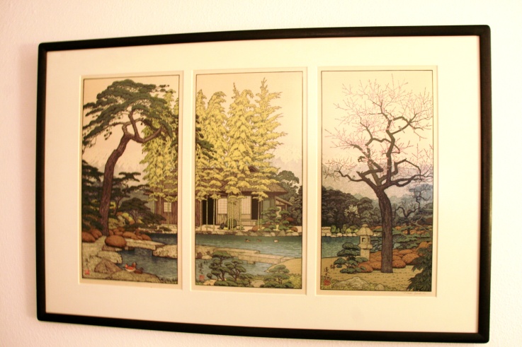
The Friendly Garden Tryptych
Toshi Yoshida
1911 – 1995
Now it’s time to take what has been learned in this course and apply it to real life. Over 17 years ago, when we lived just outside of Tokyo on Yokota Air Base, my husband and I were “milling about smartly” at an art auction at the Officer’s Club. We strolled around, chatting with friends and eventually became separated as we wandered around looking at the hundreds upon hundreds of offerings of Japanese woodblock prints. I liked many of them – but as I have learned through this course, it isn’t the style, it’s the substance. Just because I like one of a style, doesn’t mean I will like all of the same style. What is the piece saying to me? Does it make me smile? Does it make me feel nostalgic? Happy? Whimsical? Introspective? Then I saw it. Not only did I absolutely love it, but my mind immediately hung it above the sandstone fireplace in our home back in the states. I went looking to find my husband and suddenly he was beside me, telling me he had something he really wanted me to see – and to my delight, he took me right back to where I had been – the last item that was to be auctioned that night, The Friendly Garden Tryptych by Toshi Yoshida
During the 16th century, Japan was becoming “citified.” As in Europe, as people moved to the cities and specialized in certain skills or crafts, a merchant class emerged. This new middle class had increased disposable income and they wanted art. They couldn’t afford an original painting, but the woodblock print provided a way to mass produce city scenes or country landscapes in quantities and varieties to satisfy everyone. These were ukiyo-e prints. It translates roughly to “floating world” – meaning the fleeting moments of beauty to be enjoyed as opposed to the banal everyday humdrum of life. The style depicted traditional Japanese scenes. They remained the standard for a few centuries.
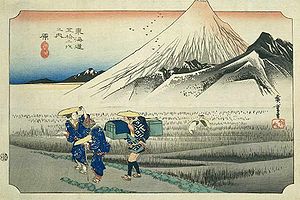
Ukiyo-e
‘Stop 13 -The 53 stops on the Road to Hokkaido’ by Hiroshige 1850
The leaders of Japan had figured out that they were woefully behind technologically compared to the West, and wanted to bring Japan up to the standards of the West, while retaining the “values of the East”, so they opened up the country to Western trade – this is called the Meiji Restoration of 1868. One of the imports was photographs, which could also be mass produced, so the woodblock print fell from favor. The period of Ukiyo-e ends in 1912 with the end of the Meiji period.
The prints that followed the Meiji period were shin-hanga (new prints) artist – which kept the traditional ukiyo-e method of production while making new prints depicting traditional scenes. This was still a collaborative effort between the artist, carver, printer and publisher. Also from the West came the idea of individuality and creative thinking, and as those ideas permeated the country, the Shin-hanga movement was rejected by some artists who began a new movement – sōsaka-hanga (creative prints). As the name implies, these prints were creative efforts on the part of the artist from start to finish – they did it all. They became the artist, carver and printer.
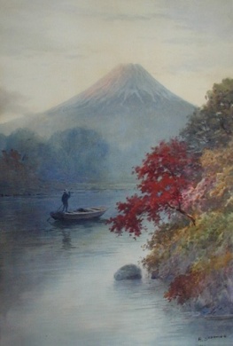
Shin-hanga
Mount Fuji by Hiroshi Yoshida c. 1920
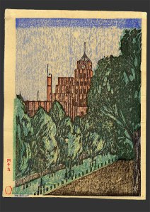
Sosaka-hanga
City Hall, Hibiya
Suwa Kanenori
1931
Sōsaka-hanga struggled during the early part of the 20th century, barely surviving during the oppressive military regime, only to emerge after the end of the Second World War as an important component of the Japanese Reconstruction – American soldiers were looking for inexpensive souvenirs to take home. Initially, many of the artists enjoyed doing abstract work as that had been banned for decades. It wasn’t long before the traditional Japanese scenery made it’s way back into the genre.
Sosaka-kanga “abstruse”
Toshi Yoshida
1964
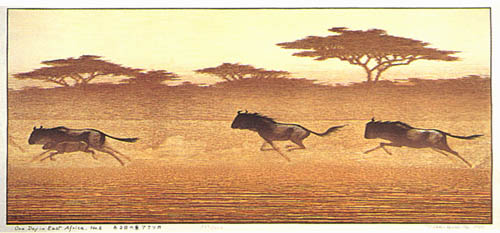
Toshi Yoshida was born in 1911 to Hiroshi and Fujio Yoshida – both accomplished woodblock artists. He was encouraged to paint and draw by his grandmother, Rui Yoshida – another woodblock artist. Hiroshi Yoshida was a shin-hanga (new prints) artist. Toshi originally followed the shin-hanga movement as his father did, but then migrated to the sōsaka-hanga (creative prints). Both father and son traveled around the world looking for interesting landscapes. Some of Toshi Yoshida’s last works were of African animals and Mount Kilimanjaro.
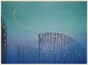
Sosaka-hanga
One Day in East Africa
Toshi Yoshida 1995
In 1980, after a long period of doing abstract work, he created The Friendly Garden – a depiction of his family home. And this is undoubtedly the nebulous “something” that originally drew me to this work. The garden and home intrigued me. I had been to homes made in the Japanese tradition and I found them very peaceful, relaxing – dare I say…. harmonious? This comes through in the work, it always seems to me that someone is going to step out of the door at any moment, wearing the traditional kimono, of course. The shaped plants of the garden are very typical of Japan. If a breeze starts up, the bamboos will begin their soft clicking as the branches rub against each other and the plum blossoms are beautiful right now, but will the breeze jar them loose, dropping them to the ground like a layer of pink snow?
Meanwhile, back at the Art Auction:
After a lively bidding war – powered by many gin and tonics my husband confided – we were the proud owners of a lovely Japanese Woodblock Print set. Framed. And until today, I only knew that I really, really liked it – nothing else. Now that I have an understanding of the history of the style and the life of the artist – mix in my previous knowledge of Nihon (Japan) – I think I will enjoy it even more now.
http://en.wikipedia.org/wiki/S%C5%8Dsaku-hanga
http://www.hanga.com/bio.cfm?ID=6
http://en.wikipedia.org/wiki/T%C5%8Dshi_Yoshida


